Arcane Collective
RightKACPER HAMILTON STUDIO

Kacper Hamilton has created the brand identity for a multidisciplinary collective who work in VFX for films as well as on creative crypto projects. The identity was inspired by secret and ancient esoteric societies as well as the mysterious world of alchemy. Kacper Hamilton took the client through a detailed process in order to create the brand identity, which included: conducting research, writing the brand brief, designing the identity and the website, selecting fonts and finally creating the touchpoints.
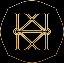
Kacper Hamilton designed the logo for The Arcane Collective to have several ‘secret’ details and esoteric references. The elements of the logo are inscribed within a circle and square, a reference to the Vitruvian Man drawing by Leonardo da Vinci. In the centre of the logo is a flame which is framed within a triangle. In secret societies, fire represents the intellect - man’s ability to problem solve and think for oneself. Fire in alchemy represents the start of the alchemical process and it is the heat of the fire that purges away all impurities and refines us to our perfect form. The triangle refers to mystic teachings for the power of three as well as the birthing of wisdom and perfectness. The triangle also represents manifestation, enlightenment and a higher perspective. The rays surrounding the triangle are a reference to the source of life and divinity. The rays are coloured in Red, Green and Blue to give a subtle hint to the world of film-making. RGB are the three primary colours used in photography and video to produce other colours and white light. Finally, there are three abstract symbols floating over the rays, which are the acronym of the brand and they also represent the mystic tools of the trade.


The logotype is based on a traditional Blackletter font. Blackletter was the first invented font in the world and it originates back to the mid-12th century in Western Europe. It was used in the Gothenburg Bible, one of the first books printed in Europe. This calligraphy style of font is characterised by its dramatic thin + thick strokes and is based on early manuscript lettering. In the modern age, many newspapers use Blackletter for their logos and universities for their diplomas. Kacper Hamilton based the logotype on a Blackletter font as a reference to history, wisdom and knowledge.
Kacper Hamilton designed the website to be cryptic and mysterious. When the website first loads, the logo and border lines are animated as if they are being drawn in chalk on a dark slate. At the bottom of the homepage, there are four abstract symbols, the same as used in the logo, which are links to different parts of the website. After a short while, a portal or diagram is animated on the homepage. When hovering over the portal with the triangle pointer, an archaic alchemy illustration image starts to appear as if by magic illumination. Every time the website is reloaded, a different diagram and illustration will appear. If the user clicks on the illustration, they will be transported through a fractal RGB animation to the work page of the website. There are further hidden details and experiences for the user to discover when using the website. The website is for clients of the ‘The Arcane Collective’ and is by invitation only.


THE ARCANE COLLECTIVE: WE PROVIDE A VARIETY OF CREATIVE SERVICES AS WELL AS VISUAL EFFECTS SOLUTIONS FOR FILM, TELEVISION, MUSIC VIDEOS AND MORE. WE ACT AS AN INDIVIDUAL ARTIST BUT CAN ALSO FORM LIKE VOLTRON. THERE ARE NO WEAK LINKS IN THE ARCANE COLLECTIVE. EACH CONTRIBUTOR IS A VFX GLADIATOR IN THEIR OWN RIGHT. WE ARE PERFECTIONISTS THAT WILL PUSH THE ENVELOPE EVEN WHEN THE DIRECTOR IS SATISFIED. WE'RE ALLOWED FULL AUTONOMY AS AN ARTIST OR TEAM OF ARTISTS TO TACKLE PROJECTS HOWEVER WE SEE FIT, OFFERING UNORTHODOX AND INGENIOUS APPROACHES WITHOUT NEEDING TO CONFORM TO PROTOCOLS OR DEAL WITH LAYERS OF INTERNAL BUREAUCRACY. WE'RE INTERESTING PEOPLE THAT GEL WELL WITH CREATIVES AND ALWAYS BRING A LITTLE PIECE OF OURSELVES TO THE TABLE.


